4.1 Healthy People
Healthy people are all alike; every unhealthy person is unhealthy in their own way. - Leo Tolstoy Anna Karenina.
A statistically-generated NMDS diagram is an easy way to show hundreds of samples at one time. Samples that are more similar to one another are shown closer together, forming “clusters” that can give us an idea of which people are most similar. (Figure 4.1)
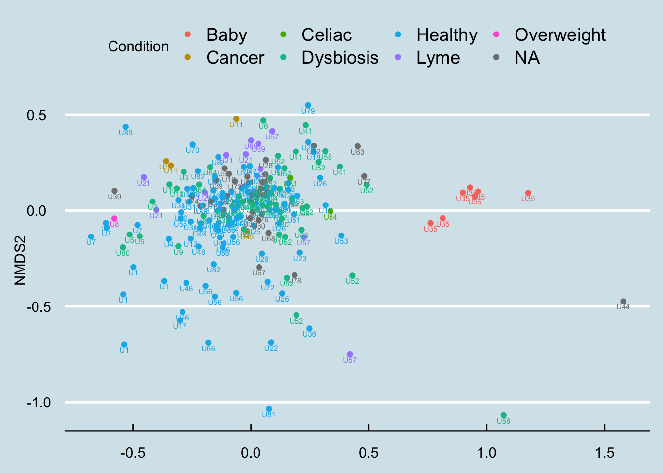
Figure 4.1: Overall clustering of hundreds of unique samples in my database.
The differences here are not strikingly obvious, but you can see a cluster among the baby samples. There is overlap, but it appears that the healthy people are generally in a separate space from the people who self-report some type of dysbiosis.
What if we look just at the “healthy” people? In Figure 4.2 I unfortunately don’t see any special clusters.
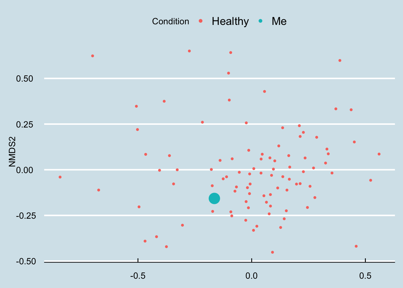
Figure 4.2: An overall look at clustering among just healthy people.